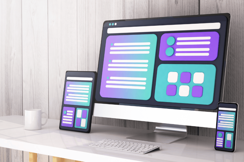
Adaptive Web Design is a must-have in today’s digital landscape. With the growing variety of devices and screen sizes, businesses need to ensure their websites provide an optimal user experience across all platforms. Unlike responsive design, which relies on flexible layouts, adaptive design creates multiple versions of a website specifically tailored to different devices. This approach results in superior performance, faster load times, and enhanced usability for users on any screen.
For businesses engaged in eCommerce development, WordPress development, Shopify eCommerce sites, React Native app development, or Laravel projects, embracing Adaptive Web Design can increase online presence and improve customer engagement. This article explores six must-know features of Adaptive Web Design and how they can help create stunning websites that captivate users and boost conversions.
1. Multiple Layouts for Different Screen Sizes
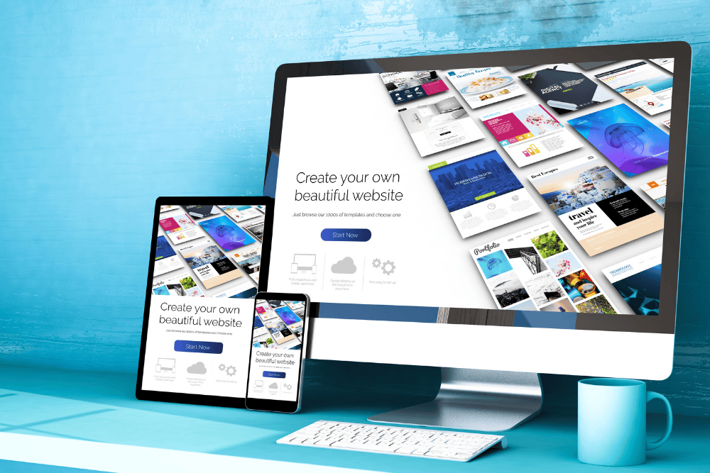
One of the defining features of Adaptive Web Design is its ability to create distinct layouts for different screen resolutions. Instead of a single, fluid design, AWD relies on predefined breakpoints to display the most suitable version of the website.
How It Works:
- Designers develop multiple fixed layouts (e.g., one for desktops, one for tablets, and one for mobile devices).
- The site detects the user’s screen size and loads the appropriate layout.
- This ensures a consistent and optimized experience, regardless of the device.
Why It Matters:
✔ Improves performance by serving only what’s necessary for each device
✔ Ensures pixel-perfect layouts with full design control
✔ Creates a seamless online selling experience for eCommerce businesses
💡 Example: Shopify eCommerce sites can use Adaptive Web Design to display a different product grid for mobile users while keeping a more detailed layout for desktops.
2. Faster Page Load Speed with Optimized Assets
Speed is a crucial factor in user experience, SEO rankings, and conversion rates. Since Adaptive Web Design serves only the assets necessary for each device, it significantly improves website loading speed.
How It Works:
- Mobile users receive lighter images and fewer scripts, reducing page load times.
- Desktop users get higher-resolution assets for a rich browsing experience.
- The system detects the device type and adjusts content delivery accordingly.
Why It Matters:
✔ Boosts SEO rankings and improves Google Core Web Vitals
✔ Reduces bounce rates and keeps users engaged
✔ Ensures smooth eCommerce development with faster checkout experiences
🚀 Example: An online store built with WordPress development can load high-quality product images for desktop users and compressed images for mobile users without sacrificing quality.
3. Device-Specific Navigation and UI Enhancements

Adaptive Web Design tailors navigation menus, buttons, and interactive elements to match the specific needs of different devices. A desktop site may feature a multi-tier navigation menu, while a mobile site may display a hamburger menu for easy access.
How It Works:
- Designers customize navigation styles based on screen size.
- Click-based interactions for desktops are replaced with touch-friendly elements for mobile users.
- UI elements are scaled and positioned optimally for better usability.
Why It Matters:
✔ Improves user experience with intuitive navigation
✔ Reduces frustration and increases time spent on site
✔ Enhances accessibility and usability for all users
📱 Example: A React Native app development company can implement adaptive menus for different devices, ensuring that mobile users get easier tap-based navigation.
4. Enhanced Mobile Optimization for Better User Engagement

Since mobile traffic accounts for more than 55% of global web traffic, it’s essential to optimize websites for smaller screens. Adaptive Web Design ensures that mobile users receive a streamlined experience tailored to their device capabilities.
How It Works:
- Mobile users get clickable elements with adequate spacing, preventing accidental clicks.
- Pages load only mobile-friendly assets, reducing unnecessary elements.
- Text sizes and buttons adjust dynamically for better readability and usability.
Why It Matters:
✔ Delivers a superior experience for mobile-first users
✔ Helps eCommerce development by making shopping easier on smaller screens
✔ Ensures compliance with Google’s mobile-first indexing for better SEO
🛒 Example: A Shopify eCommerce site using Adaptive Web Design can display larger call-to-action buttons for mobile users while keeping a more complex desktop layout for detailed product browsing.
5. Improved Security and Performance Through Selective Loading

Adaptive Web Design allows websites to load only the necessary scripts, plugins, and assets, which enhances security and performance. Since unnecessary elements are not loaded, there are fewer vulnerabilities and potential entry points for cyber threats.
How It Works:
- Websites disable heavy scripts that aren’t required for mobile users.
- Fewer third-party plugins are loaded, reducing exposure to security risks.
- Laravel development and other frameworks can implement security measures specifically for different device types.
Why It Matters:
✔ Reduces website vulnerabilities and security risks
✔ Speeds up website performance by eliminating unnecessary components
✔ Helps maintain PCI compliance for eCommerce transactions
🔐 Example: An eCommerce store built on Laravel development can use Adaptive Web Design to disable complex animations on mobile to improve speed and security.
6. Better User Experience Through Context-Aware Design

Adaptive Web Design allows businesses to personalize user experiences based on device type and browsing behavior. By understanding how users interact with different screens, businesses can offer contextually relevant content.
How It Works:
- Websites detect whether users are on a desktop, tablet, or smartphone and adjust content accordingly.
- Mobile users may receive simplified product descriptions, while desktop users get detailed specifications and videos.
- ECommerce sites can show different payment options based on device type.
Why It Matters:
✔ Increases engagement and retention with a customized browsing experience
✔ Helps businesses increase online presence and conversions
✔ Reduces friction in the customer journey
🎯 Example: A Shopify eCommerce site can offer a one-click checkout for mobile users while providing a more detailed shopping cart for desktop users.
Final Thoughts
Adaptive Web Design is a game-changer for businesses looking to build stunning, high-performing websites. Whether you’re developing WordPress websites, Shopify eCommerce sites, React Native apps, or Laravel-based platforms, Adaptive Web Design ensures that your site is fast, secure, and optimized for all devices.
By implementing multiple layouts, optimized assets, device-specific navigation, mobile enhancements, security measures, and context-aware design, businesses can increase online presence and improve user engagement. For eCommerce development, this means higher conversions, reduced bounce rates, and an overall superior shopping experience.
At Panalink Infotech, we specialize in designing high-performance adaptive websites tailored to your business needs. Whether you need WordPress development, Laravel development, or Shopify-based eCommerce solutions, our team can help create a future-ready website for you.
📩 Want to build a website that adapts perfectly to every device? Contact us today and we will help you with it!